

Sunday, April 22, 2012
My tiniest fan!
At the opening reception for the Somerville Museum exhibit on Friday night, we saw this little kid analyzing my map drawing with his dad. Apparently they were charting the course they would take through this particular imaginary place. The exhibit has work by 150 different local artists participating in Somerville Open Studios, and it's on display through May 18th.

Monday, April 9, 2012
Watery Maps
I've been making more maps lately with wide stretches of watercolor and interconnected islands. I like the watery, organic texture of the watercolor and then the precise road lines. I started with small card-size drawings:


9"x12":

and a huge 18"x24" drawing that was in the City Hall show last month:


9"x12":

and a huge 18"x24" drawing that was in the City Hall show last month:

Recently a lot of people have been sending me links for the City Tracking project which uses Open Street Map data in artistic/informative ways. The Watercolor style is particularly similar to what I've been making lately, so I thought I'd post it below. I recommend checking out the project, it's very cool!
Friday, April 6, 2012
Inside-Out Gallery in Davis Square
The windows by the Davis Square CVS always show an art exhibition, and this month they're featuring artists participating in Somerville Open Studios. I have a couple map drawings in the display, so if you're around Davis I would recommend taking a look!


Sunday, April 1, 2012
Interview with Babel/Salvage
I recently participated in an email interview with Babel/Salvage, a blog/small press/fledgling boutique in Seattle. Check it out if you ever wanted to hear me muse about what I do for pages and pages. The interview is currently at the top of their blog, but the permalink is here: http://babelsalvage.wordpress.com/2012/03/30/featured-artist-emily-garfield/
Thursday, March 29, 2012
CraftBoston Spring 2012
Last Saturday I spent several lovely hours taking in the sights at CraftBoston, held at the Seaport. I had been surprised to learn that the event was going to have a steampunk theme, but it turned out that that was relegated to one section and the theme of the talks; aside from that, the event was very similar to last year. I did notice that a large portion of the booths had bright "New Exhibitor" signs on them, and I saw a lot of artists I hadn't seen before. A few highlights:
- Swan and Stone Millinery had a variety of wonderful hats and fascinators incorporating feathers and felted flowers. I really should have tried some on!
- There were a lot of stalls with ceramics at CraftBoston, but I'd never seen anything like the Art Nouveau style ceramics by Stephanie Young before. Her website has a lot of interesting information about her process and inspiration as well. I just saw her work at 13Forest Gallery when I was dropping off work there, so you can see a sample of her style in Arlington as well!
- I remember seeing Joe Bagley's amazing papercuts last year at CraftBoston Spring, but I was glad to have a chance to peruse them again. I was also amused to see a sign in the stall stating that one of his papercuts (a couple on a bicycle, I believe) was the first image pinned on Pinterest. Neat!
Sunday, March 25, 2012
Forged Wire Rings
After the recent craziness of my schedule, I just had to doodle around and make something new -- and I'm pretty happy with how it came out! I saw a lot of rings like this while we were in San Francisco and I love the idea. I took it a step further by oxidizing the copper after forming these rings, then buffing off parts of it to reveal the pink copper color. I love how every second in the liver of sulfur bath creates a slightly different tone in the copper -- it turns from gold to maroon to grey to blue-black, all in about 20 seconds (depending on the heat of the bath and wire, I believe). Unfortunately the color in these photos isn't great, but it should give a sense of the difference in color that happens after only a few seconds.


Bronze hue (only a few seconds in the liver of sulfur):

Maroon-pink shade (about 8 seconds):

Deep grey (more than 20 seconds; burnished afterwards to bring out some of the pink color):

Detail of the pattern:

Saturday, March 3, 2012
City Hall Show

I have eight pieces in this show -- four 18"x24" drawings (three of which are totally new!), and four of my favorite 8"x10" - 9"x12" drawings.
Also, for anyone attending the TEDxSomerville conference at the Armory tomorrow, I will have a selection of works in the art show there, including a necklace and a teapot among others.
Thursday, February 23, 2012
New 18x24 maps
"Seven Cities" (pen and marker on bristol, 18"x24")


"Graphite Civilization" (pen and graphite on bristol, 18"x24") - not quite finished

And a detail snapshot of one I'm still working on that's currently untitled -- any suggestions?

Tuesday, February 21, 2012
San Francisco
I haven't been posting much because I've been madly working on large drawings for a show at Boston City Hall (more on that later!), and also because I was away for about ten days visiting friends in San Francisco and SoCal. Here are some of the things I saw (click on them for the full effect):


Thursday, December 15, 2011
New Booth Setup
For the Holly Fair last weekend I thought it would be a good idea to refine my booth setup, which is usually just a bunch of random stands and boxes that I've acquired over the couple years I've lived in the area:

It's always worked out for me in a sort of homey way, but I recently realized that the huge variety might end up overshadowing or obscuring the work. I also wanted to make sure visitors knew that both the maps and the jewelry were made by the same person. I did some brainstorming with a friend and decided that the deep red chests (which I came upon by lucky chance at a yard sale just days before my first craft fair ever!) should determine the look of the rest of the setup, since they're my favorite part. Besides those dark-colored display pieces, though, most of my work (especially the jewelry) looks better on light colors. I decided to go with a frame theme to connect the art to the jewelry, and also to set off the jewelry in their own spaces for each type. It's difficult with work this varied and individual, but I think my solution worked out pretty well:

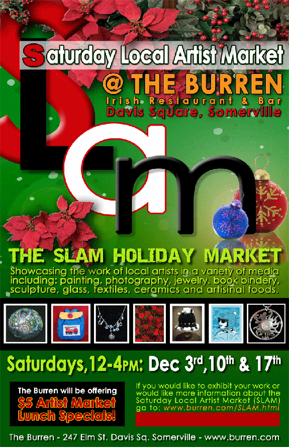
I kept the earring stand, but painted it to match the fittings on the red chests, and replaced the old plastic cross-stitch mesh with light cream cross-stitch fabric, which still has holes for earrings to go into but is less translucent (so the earrings don't end up being backlit, which gets annoying) and also more organic-looking. I also kept the red frame with white lace since it's always caught people's attention, and goes well with the chests. For the flower earring display, I scrapped my old system of a cigar box with plastic mesh (too distracting and thrown-together) and hung the earrings with more space on two blank canvases hinged together like a book. I like the way it all comes together, and I think visitors enjoyed discovering the jewelry without having to search for it. We'll see if it works as well in the darkness of the Burren's back room this weekend!

It's always worked out for me in a sort of homey way, but I recently realized that the huge variety might end up overshadowing or obscuring the work. I also wanted to make sure visitors knew that both the maps and the jewelry were made by the same person. I did some brainstorming with a friend and decided that the deep red chests (which I came upon by lucky chance at a yard sale just days before my first craft fair ever!) should determine the look of the rest of the setup, since they're my favorite part. Besides those dark-colored display pieces, though, most of my work (especially the jewelry) looks better on light colors. I decided to go with a frame theme to connect the art to the jewelry, and also to set off the jewelry in their own spaces for each type. It's difficult with work this varied and individual, but I think my solution worked out pretty well:

I kept the earring stand, but painted it to match the fittings on the red chests, and replaced the old plastic cross-stitch mesh with light cream cross-stitch fabric, which still has holes for earrings to go into but is less translucent (so the earrings don't end up being backlit, which gets annoying) and also more organic-looking. I also kept the red frame with white lace since it's always caught people's attention, and goes well with the chests. For the flower earring display, I scrapped my old system of a cigar box with plastic mesh (too distracting and thrown-together) and hung the earrings with more space on two blank canvases hinged together like a book. I like the way it all comes together, and I think visitors enjoyed discovering the jewelry without having to search for it. We'll see if it works as well in the darkness of the Burren's back room this weekend!
Subscribe to:
Posts (Atom)


