Thursday, August 30, 2012

Gel Transfer Mini Canvases

I was looking for new options for inexpensive and reproducible product options recently, and started playing around with transfer techniques, which I first learned about in intro art during freshman year. I was particularly interested in gel medium transfers, where you use acrylic gel medium to transfer the ink from a toner print-out onto another surface. In class we used it mainly to transfer to other pieces of paper, which seemed slightly pointless, but after poking around on the Internet I got inspired to try it with wood and fabric instead. I found that it works well on gessoed canvases; my preliminary project has been making adorable tiny canvases for a giveaway (more info on that at the end of this post!!)
I start out with a piece of printed image around the size of the canvas or larger. The great discovery of this round of transferring has been that you can use full-color images with no ill effects. I had always been told in class that you could only use black and white Xerox copies, so I was pleased when the color in my transferred drawings came out almost as well as the original watercolor.
I have a lot of gel medium hanging around, so I got to experiment with different weights and styles. For this canvas I've used gloss gel, and applied it in a thinnish coat all over the canvas, then placed the image on top of the gel face down.
Then I burnish the image all over to make sure it sticks, starting from the middle and moving to the outside to reduce air bubbles as much as possible. They tend to introduce holes in the image, which can be interesting but hard to control. 
After the paper dries, I spray the back of the paper with water to saturate it and start to rub off the paper on the outside. The idea is that the ink sticks to the dried gel medium and the paper rubs off. 

Once all the paper is off (which often takes several tries), I paint it over again with gel medium to seal it, and then it's done!
I will probably be offering these on Etsy in the near future, but for now the only way to get one is to purchase a $10 ticket to RAW Artist's Showcase, a spectacular night of art, music and fashion in Boston on September 13th. In order to participate in RAW, artists are obligated to help sell tickets to the event, so I am pleased to offer these canvases to thank you for your support. The retail price of these canvases will be at least $12, so regardless of whether you use your ticket, this preliminary offer is an excellent deal. Canvases are only available to the first 20 people to buy tickets before September 10th, so act soon!

UPDATE (9/01 2:00pm): There are currently only three tickets remaining in the giveaway, so if you're interested in a free map canvas but haven't gotten your ticket yet, now's the time! Thank you everyone for your support!


Sunday, August 5, 2012

First Friday in the South End - August

Last Friday evening I spent several hours in the studios and galleries at the 450 Harrison area of the South End. I came across a surprising number of works that resonated with my interests. Some highlights:

The first maplike works I came across were at Kingston Gallery by Chantal Hardy, in an exhibition called "Current" which was right up my alley. Most of the works they had appeared to be abstracted aerial views of islands, but I was particularly arrested by one piece in which the artist had gone back in and added a framework on top of some of the topography. I have to paste her entire artist statement here because it just sounds so much like my approach:
"A limited palette and a narrow vocabulary of marks in pen and ink on watercolor paper hold infinite possibility. The accretion of tiny, taut tick marks and earth toned dots gives birth to continents and islands, to mountains and shorelines, to highways and harbors. Organic landscapes are bifurcated by cities and geometric, manmade infrastructures. The topography builds itself, like land out of lava, as I scrape the metal nib ad infinitum or allow the pen to linger, bleeding ink into wet paper. This truly is art as an act of creation. Having gone off the map, I am literally making a world."
I wasn't able to find anyone working in the gallery to ask if I could take a photo, and she has none (of that series) online, but I suppose that's her loss.

I also stopped into Soprafina Gallery and was a bit interested in one work by Thaddeus Beal, but my interest was cemented when I started reading about his inspiration and concepts, which apparently include fractals and chaos theory. It reminds me of how Jackson Pollock's works have a fractal structure despite (or perhaps due to?) their intuitive construction. I'll have to keep an eye on this one!


Thaddeus Beal, "Breaking Symmetry", mixed media on wood


I saw some literature outside Rhonda Smith's studio at 450 Harrison that caught my eye. Unfortunately the studio wasn't open during the event, but I'll keep it in mind for Open Studios in the fall. Her work has a lot of intricate, maplike elements, and in fact in part of her artist statement she writes "As I am working I am often thinking of water, webs, tectonic plates, even my recent subway ride: that is, any phenomena that I can map or follow"


Rhonda Smith, "Lands Moving" 2012, oil and pencil on panel


Right when I thought I had seen everything in 450 Harrison, I remembered for the first time in several months that there is actually a fourth floor with artists as well. I wandered into one studio and saw some work I'd never seen before. Apparently the artists had just moved in this spring. I was immediately stopped by a huge painting of an aerial view of Logan by Lynda Michaud Cutrell, from her Google Earth series. Something about the way the building network was depicted was very biological, almost like a small intestine. This worked well with other work in her studio, which included a layered painting of molecules and other biological building blocks. I'd be interested to see if she does any work that combines the two!


Lynda Michaud Cutrell, "From Up Here... Everything Looks Organized"

Friday, August 3, 2012

Satellite Cities

I sketched out this idea about a month ago and didn't get a chance to work on it until now. I'm a little constrained by my materials at the moment but I managed to make enough pieces to give a sense of what an installation would look like.


Tuesday, July 24, 2012

ArtBeat and "Map Your Own Davis Square"

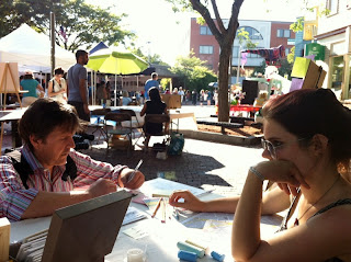
Last weekend I had a booth at ArtBeat in Davis Square with some of my work as well as an experimental crowdsourced mapping project where visitors could add their experiences to a map of the Davis area. I've never done an interactive project before, and it was definitely a learning experience. I tried to anticipate what problems might arise, and I'm pleased to say that there weren't any big problems, besides participation. I think that there were just too many steps -- I tried to make it as open-ended as possible, which helped a little bit, but still most people just passed by, even if they expressed interest. It's also the kind of project that only really gets off the ground when enough people have added to it to show value (and make individual submissions less prominent), so that can easily push it into a cycle of non-participation.
The booth started off with a list of instructions, flyers for recording inspiration, stickies and a blank map:


By the end of the festival, the outer edge of the map was covered with stickies, and the corresponding dots were interspersed throughout the map:

Some selected stories:


and other booth shots:


Thursday, July 19, 2012

Drypoint Maps

Last weekend I took a workshop at Maud Morgan Arts on drypoint, a printmaking technique that involves etching lines directly onto a plate. I've never tried that kind of printmaking before -- the only prints I've made have been with linoleum or woodblock, where gouges are made into the surface and the ink rests on the remaining surface. Drypoint, on the other hand, is an intaglio process (like etching or engraving), so the print is made by inking the plate and then wiping off all ink on the surface; the ink that sits in the engraved lines is printed onto the paper. In drypoint the ink doesn't just sit in the grooves, but is also caught by the minute burrs that form when you scratch into the surface. What's counterintuitive about it is that large areas of black aren't created just by a deeper groove, but mostly by a denser mat of crosshatching.


We started by learning about the tools and practicing on small pieces of copper, and then started our first plates using plexiglas. The biggest benefit of plexiglas for translating an image into a drypoint etching is that you can just place the image under the plexi (assuming it's either been reversed or you're okay with it printing backwards) and then trace over that with the etching tools. I also found that it was a little easier to control the tools over the soft plexiglas surface. Unfortunately, the cheaper material doesn't hold the cuts as well, so apparently you can't make as many prints from a plexi plate.


Once you're at a stopping point with a plate, the next step is inking and printing it. The hard part of inking is that you can't just roll or brush ink on and then print -- you have to meticulously work ink into the minute grooves (without disturbing the burr too much, since it does wear down), and then spend ages trying to wipe off the ink with a light enough hand that you don't end up wiping off the parts you want to have ink. I only almost got the hang of it once we were out of time.

The inking station:


The wiped plate on the press:


I made one print with plexi by tracing over a printout of one of my drawings, and then decided to do my copper plate completely freehand. I discovered that the process feels, surprisingly, less like drawing and actually more like making cutouts -- you have to apply a lot more pressure, and be more aware of the quirks of the medium. 


It's all totally worth it, though because the results were AWESOME. I've always wanted to experiment with having more gradient over my works, a more integrated combination of organic wash and controlled lines, and this is basically exactly what I was looking for. The plate holds on to ink in kind of unpredictable ways, but you can selectively remove ink and control the rhythm of ink density across the plate with wiping as well as the depth of the original cuts. Here are two prints of my freehand map, made one after another (re-inking, of course, but without any changes to the plate between prints):
MAJOR differences in terms of density, contrast and overall rhythm. I'd almost say it looks like a different city. And that's what I'm trying to explore -- making maps that could be anywhere just with a few changes. 
I eventually went back and hatched in every little house (temporarily killing the nerves in my thumb in the process, I think) to make my last print, which I think looked even better:
And here's the plexi print as well (I obviously got some help in the ink wiping department, because it's much less grey):

I would definitely keep exploring this, as long as I can figure out some kind of reasonable way to get access to a large press like the one we used. Unfortunately that's definitely necessary to get the kind of pressure you need for these prints. But it's obviously worth it!

Monday, July 16, 2012

New Water Resist Maps

I recently came across a call for artwork to be shown in a store in Central Square, and decided to make something large and colorful to submit to work with the space. I ended up with two 15"x20" water-resist maps (like this one, which sold last summer - I haven't worked in this style since).

The first one I tried was just a radial streets pattern:


Removing the rubbery strings of rubber-resist:


and the second one I tried to build around a central fabricated (maybe too fake-looking) river:


I called the first one "Strata" and the second "Sediment", to relate to the way they were built up in layers. The finished pieces:


They look better smaller! In real life they're 15"x20" and framed in 18"x24" frames. I brought "Sediment" to an art crit last weekend and displayed it together with the first water resist piece I tried (the one that's still in my possession) to ask why the first smaller one was more visually successful than the larger, more recent one, which ostensibly would have more experience behind it. The consensus seemed to be that there still wasn't enough experience; I had to get used to the large scale and the materials before it would look better. I guess the smaller one was just chance! Here's the setup we critiqued:


In the end, both "Strata" and "Sediment" got accepted into the exhibition, which will be at Boomerangs in Central Square starting July 16th. For a full list of my current and upcoming shows, you can always check out my website