I finally completed a project that was about a month overdue -- a large necklace in the twiggy floral style for Mobilia Gallery's jewelry exhibit "Objects of Status, Power and Adornment". I used oxidized sterling silver wire, iolite beads (which are a shade of blue I can somehow tolerate!), faceted blue-grey glass beads from Toho Shoji in New York, and singed fabric flowers. I think the necklace took so long mainly because many of the techniques were new to me, since I don't usually work in silver. I also noticed that a lot of the chemicals involved (liver of sulfur to oxidize the silver wire, even the wax to polish and protect the oxidized wire) gave me headaches, so I couldn't do them very often or for long stretches. I don't know how metalsmiths manage! I suppose the draw is similar to working in the darkroom -- you have to go through long and tedious processes with smelly and often dangerous chemicals, but in the end something magic and luscious is created and you get to hold it in your hands.
Saturday, October 29, 2011
Wednesday, October 26, 2011
Wednesday, October 19, 2011
Halloween Craft Fair at the Burren Oct 29th!
I will be participating in a Halloween-themed market (perhaps even in costume!) at the Burren in Davis Square on Saturday, October 29th. New works will include one-of-a-kind woodblock print cards, hand-painted autumn tree pins, and a brand new collection of twiggy floral earrings. Of course there will also be map art and cards as well as other standard goodies.
Tuesday, October 11, 2011
Woodblock Print Map Cards
I recently decided to try using the woodblock I used in this post to make one-of-a-kind printed cards. I just love how the prints come out completely differently each time, so that even though the same block is used each time, the cities each look unique.
Those were all done with the same block, but because the ink was particularly watery, different parts of the map was revealed each time. I also love the organic texture of the ink, which makes the black parts look like bodies of water. The process works well with my general concept of map-making; the marks are very controlled, but the outcome of the piece depends on organic processes that are out of my control. The cards are currently available on Etsy if you'd like one of your own!
I also just started doing larger prints that take up most of the card's front. I need to get some more delicate woodcutting tools, though, because the roads stand out a bit too much for me. The watery texture makes the scale really off. So far I think the middle one of these cards is the most successful:
Tuesday, October 4, 2011
Copper Printing
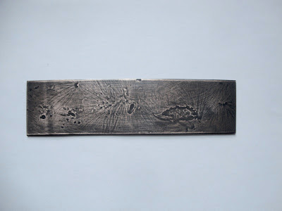
Yesterday I went with some friends to New Bedford Open Studios, and we had an amazing time. I especially enjoyed learning how to impress materials into copper at Sue Kowalski's studio (which is beautiful in itself -- it's in an old church!). We placed dried plants on copper strips, and then put a harder brass strip on top and ran it through a roller press. Because the copper is softer, when the plants get squeezed between the two materials they impress their forms onto the copper. I used milkweed pod silk, which is pretty much entirely without substance, so it didn't make much visible effect until I darkened the copper strips with liver of sulfur and buffed off the top layer. The patina stays in the lower indentations made by the plant material and makes the design easier to see. Here are some examples:
Sanding off the patina struck me as incredibly like working in the darkroom, and selectively dodging or "bringing up" certain parts of the image. The big difference is that when printing plants with cyanotype or other sun prints, the print is made by the differences in opacity, while with physical printing the print is made by the differences in thickness. Of course, there is a direct relationship in many ways between the thickness of a plant and the opacity; in fact, when we were having trouble placing the plants, Sue reminded us to think of the "shadow" of the design (basically the negative space) to judge whether the design would be too dense. The resulting patinaed prints did look pretty much like what you would get from a sun print, but with added texture.
Milkweed pod silk
Milkweed pod silk with some seeds attached (which exploded in the press...)
Shepherd's purse, a much more substantial plant
Sanding off the patina struck me as incredibly like working in the darkroom, and selectively dodging or "bringing up" certain parts of the image. The big difference is that when printing plants with cyanotype or other sun prints, the print is made by the differences in opacity, while with physical printing the print is made by the differences in thickness. Of course, there is a direct relationship in many ways between the thickness of a plant and the opacity; in fact, when we were having trouble placing the plants, Sue reminded us to think of the "shadow" of the design (basically the negative space) to judge whether the design would be too dense. The resulting patinaed prints did look pretty much like what you would get from a sun print, but with added texture.
Subscribe to:
Posts (Atom)


