I was in New York this past weekend to see some friends at the LIC Arts Open, which this year was a week-long event. Unfortunately I didn't get to see all of them, but I did come across some fun new artists at the Juvenal Reis studios.
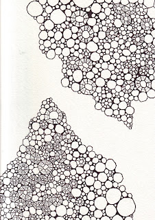
I was particularly taken with the detailed, almost obsessive pen drawings of Rena Teratani, who is apparently having an exhibition in Montreal in June. Unfortunately the website images and printed postcards don't really show the incredible detail in her pieces. Her work reminds me a little of Julie Mehretu's mark-making, and apparently reminds others of mine -- at open studios, a friend saw the map I have on the back of my phone and thought it might have been something Rena drew! The fact that she does detailed drawings on a large scale has convinced me that my drawings might actually look okay if I did them significantly larger than my usual 9"x12".
The other super memorable art we came across this weekend was hidden in the lower floor of a secluded gallery in Chelsea. Paul Shore & Nicole Root's photographs had made the Internet rounds a while ago, but the full collection was really amazing. They reproduce iconic works of contemporary sculpture in candy, and photograph them in mini gallery setups that make the candy to scale with the original work. I really appreciated the Dan Flavin light installation (one wax stix candy in the corner of a room) and the initially befuddling Claes Oldenburg (naturally, a real ice cream cone and slice of cake). Do check out the link above if you've ever taken contemporary art history.
Monday, May 23, 2011
Wednesday, May 18, 2011
Faceted Maps
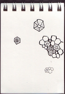
The other day I was doodling map ideas in a coffeeshop, and started building this:
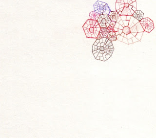
It's not maplike in the way my other drawings are, but it's got the same kind of linear fractal aesthetic. I definitely think of them as roads connected into neighborhoods, they're just arranged a little differently. I played around with color when I got home:
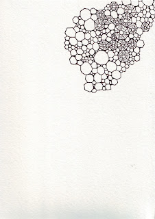
I'm not sure how much I like that, though. I think they need some kind of color, but maybe I'm just not good enough with colored pencils to get the effect I want with them. They might work out better with a light watercolor wash that changes over the course of the drawing. I do want to delineate "neighborhoods" with color, and that might be a good way to do it. I started building another drawing on watercolor paper, using archival pens:
I've put this project on hold to work on new "mosaic" style maps (more on those soon!), but it was a sort of promising side project. If anyone has any ideas about extending it, let me know in the comments!
Monday, May 9, 2011
Somerville Open Studios Recap
Open Studios was surprisingly hectic, but really amazing. I met a lot of people who were really interested in my work; two of my favorites were a young child who came to my table, politely asked to buy a print (after studiously perusing the designs available) and even signed up for my mailing list, and a guy who ran over on a friend's recommendation, took a glance at my table and the drawings I had on display and summed up his review by exclaiming "Holy shit."
Because I was behind the table the whole time, I didn't get a chance to look at many other artists' work, but I did take one opportunity to run around the space a little, and I even had some fans bring me business cards from other artists they thought I'd like. I was recommended to check out one of the tables in the Armory because the artist was working with cut-outs from roadmaps, and when I got a chance to see her work it turned out she already knew about my maps and had bought two pieces from me! It's getting to be a smaller and smaller world, and I love it.
Because I was behind the table the whole time, I didn't get a chance to look at many other artists' work, but I did take one opportunity to run around the space a little, and I even had some fans bring me business cards from other artists they thought I'd like. I was recommended to check out one of the tables in the Armory because the artist was working with cut-outs from roadmaps, and when I got a chance to see her work it turned out she already knew about my maps and had bought two pieces from me! It's getting to be a smaller and smaller world, and I love it.
I also met a lot of interesting artists by chatting with the people who came by my table. I had some new, stylized watercolor maps out, and got into a discussion with a photographer about how they resembled some work he'd done with images of cobblestones.
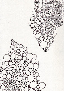
He works with much brighter colors than I do, so his image is a lot more eye-catching. I should definitely think of using more color; even if it's not something I normally do, it does get peoples' attention. I had prints of "Growing Fields" (by far the most colorful map I've done) for the first time at Open Studios, and almost sold out of that one design. I'm thinking of doing the abstract maps (like the one above) in brighter colors, to make more graphic map representations.
Subscribe to:
Posts (Atom)


