Thursday, March 31, 2011

Cutout Maps

I've been making both maps and pop-ups for a while, and I finally got around to combining the map aesthetic with the papercut technique. 

I started with black cardstock:


This was a little too hard to cut, so I moved on to thinner white paper, and experimented with adding depth via multiple layers:


The piece looks entirely different when backlit:


Then I realized it might add visual interest to cut through a printed page, so I worked on obliterating a page from an art course catalog:


I took care to cut out all names and numbers, but kept in some words like "landscape" that I thought would be appropriate. It was a fun project; I'm trying to think of what kinds of pages to try next...!

Tuesday, March 29, 2011

Ascension by Su-Yee Lin

My friend Su-Yee has a short story online in Ideomancer's March issue. It's very autumn and very quiet, and you should read it. Su-Yee collaborated with me on an illustration project in 2009, which you can peruse on my old site here. I feel like our styles are very related, and I love reading her work.

Monday, March 28, 2011

Stop-Motion Map Drawing

I made a stop-motion animation while working on the multi-part map I drew for my senior exhibition in 2009. It was probably the first map I made in this style, so it's interesting to see how different my technique was then.

Wednesday, March 23, 2011

HTML5 Military Jacket


My friend has suggested for a while that the HTML5 logo would look good as a military-style patch, and I only recently got around to the project. Originally I was going to do some kind of iron-on transfer, but I figured hand-painting it would make it more personal. I think it came out really well!

Before I started on the large logo, I made a strip of icons representing various tech classes in HTML5, to go across over the jacket's breast pocket. I sketched the shapes freehand and then filled them in using bronze-colored acrylic paint.


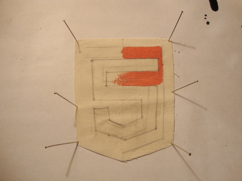
The HTML5 logo is graphic and shield-shaped. It works pretty well for a patch. I sketched the logo onto fabric (this time with the help of a ruler, since the straight lines are pretty crucial) and mixed paint to match the orange shades.


I pinned the fabric to a thin corkboard so that it wouldn't buckle too much under layers of wet paint.


I decided that the four logos needed something to make them pop, so I outlined them in pen (I settled on a waterproof, bleedproof Copic after exhaustive testing).


I folded under the edges and made small hems across the top and bottom, then sewed pieces of velcro to the ends and middle of the strip.


The strip attached to a piece of velcro already on the right side of the jacket, and I sewed a slightly larger backing to the HTML5 logo and pinned the whole thing to the left sleeve. Here's what the jacket looked like on:


I might want to make the logo strip a little smaller, but I don't think paint would still work in that case; paint pens might end up being better. Overall, though, I think it worked surprisingly well.

Monday, March 14, 2011

Celtic Knot Bracelets

I intended to have these ready for the St Patrick's Day SLAM on Saturday, but unfortunately my sewing machine wasn't cooperating. I've finished them now, though, and they're available on my Etsy site for a limited time.

Deconstructed Maps

I came across this fascinating treatment of maps recently (via Strange Maps). The artist takes city maps and picks out the individual blocks, then arranges them neatly by size and type. It's a very different way to approach the concept of a map. This is what happens with Manhattan and Brooklyn:


Sunday, March 13, 2011

Inkpunk Artworks

I had a great time yesterday at the St Patrick's Day SLAM at the Burren. I chatted with a lot of interesting people, had a lot of people sign up for my mailing list, and I got to trade with a vendor! I was given a wonderful mini painting by Brian of Inkpunk Artworks, and gave him a "Five Towns" poster. When I put them together, they looked surprisingly related:


In the mission statement on his blog, Brian mentions, "I'm finding that there is indeed a universal place where art and science, the sacred and the mundane can meet, in certain forms and colors that seem to appeal to us unconsciously on a variety of levels, and hope to take this exploration further." That's very related to how I feel about map drawing -- I approach it scientifically or algorithmically, but somehow the fractal form of a map has fairly universal aesthetic appeal. Brian's paintings remind me that when I was studying aesthetics, some of the basic findings were that people prefer centered images and round images. I always discounted this as overly simplistic, but I'm finding more and more that there's a thing for circles in art and studio jewelry. I sometimes make fun of this with my maps, drawing illogical traffic circles for purely aesthetic appeal, or making ridiculous spiral roads. But it seems there is something to that design after all.

Monday, March 7, 2011

Somerville Open Studios - Save the Date

I will be participating in Somerville Open Studios again this year, and again at the Armory (191 Highland Avenue). The event is April 30th and May 1st. I hope that everyone will be able to come!

I will also have three drawings in a show at Bloc 11 in Union Square (11 Bow Street). The exhibition will be up from March 14 to May 3, with an opening reception on March 14th from 6:30-8pm catered by the cafe. Put this information on your Google Calendar with this button:

Wednesday, March 2, 2011

Metropolitan Museum of Art


I was in New York last weekend, and on Sunday I took some visitors to see the Met.


Francesco Guardi, Fantastic Landscape (c. 1760)

Anthonis van den Wijngaerde, View of Rome (c. 1540)

Henry Lerolle, The Organ Rehearsal 


Ancient Egyptian stamps

Pillar in the Greek and Roman Art court

Floral pattern on a suit of armor